
WooHoo! Today we learned how to create an Ombre effect with embossing powders. So Cool! Amber Kemp-Gerstel provided a video where she demonstrates how to ink up a sentiment stamp with VersaMark, stamp it, then layer different shades of embossing powder, one below the other, to give an ombre look when it is heat embossed. So Cool -- oops, I already said that!
I tried it first in blue, then green.
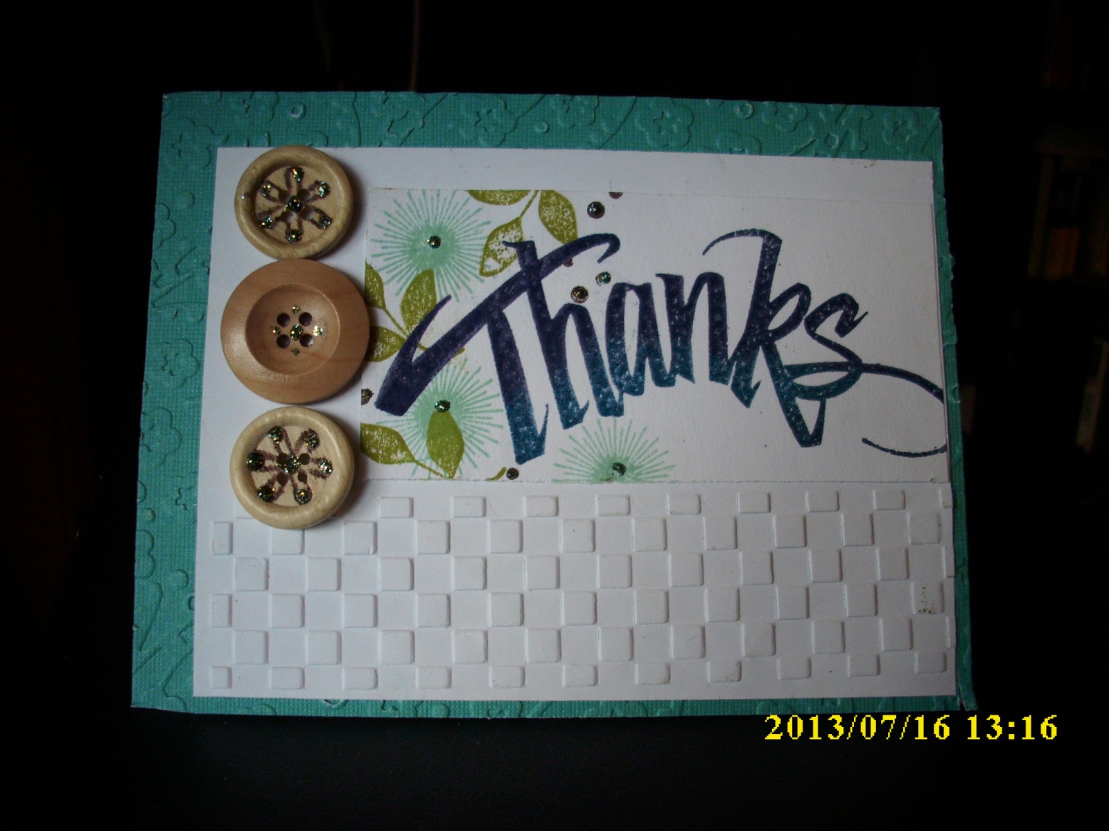

They are both very cute! I love the way the ombre effect looks and I will have to try that hopefully tomorrow :)
ReplyDeleteGreat ombre work, Sharon! Wow!
ReplyDeleteGreat embossing, Sharon! These both turned out really well!
ReplyDeleteLOVE your ombre work!! Such pretty cards!!
ReplyDeleteNice job! What a great sentiment to use for this type of look!
ReplyDeleteYou really got that ombre look with both of these cards. Great font choice and wonderful colors.
ReplyDeleteWow awesome work with the embossing powder ombre technique! I also love the dry embossing on the cards!
ReplyDeleteGreat work on the Ombre! My fave is absolutely the green card, perhaps because I love green colours :)
ReplyDeleteI like the second one better. I like the randomness of the buttons. Green is one of my favorite colors and I love these shades.
ReplyDeleteThe embossing and the buttons on both take these up to another level-- and of course the ombre effect is just right!
ReplyDelete