Wednesday, July 31, 2013

Love of Flowers


I love this stamp set from Gina K Designs. I added dimension to the card by propping the green layer up on pop dots. I also added some gold gems to the center of the flowers and a floral brad toward the top of the circle.

This card is for the Outlawz Color Challenge, where we were to include Ocean Blue, Lemon Yellow and Luscious Lime.

Thanks for looking! Hope you remember to leave a comment. That's what keeps me going! Thank you!

Tuesday, July 30, 2013

Just for Fun

You can see the sun's rays across the card--that was a "natural" special effect, quite unplanned!

This was a fun card to create for Outlawz Greeting Card Challenge, "Anything Goes--Just Have Fun!" I have had this stamp for many years but rarely used it. The patterned paper is even older, but one I thought appropriate for this image.

Thanks for stopping by! I am motivated by your comments, so please leave a note and say Hi! Thank you!

Chocolate!

This card was created to meet a challenge to include chocolate for Outlawz. Let me tell you, it wasn't easy because of my limited supplies in that regard...at least in my scrapbook room! If I could've gone to the kitchen to get what I needed, that would be a different story!

The stamps used are from Stephanie Barnard's Stamps of Life. I had the paper on hand, as well as the brass gems. I used chocolate chalk ink for the sentiment.

Monday, July 29, 2013

Wrap-Up II

Online Card Class Summer Card Camp2
Wrap-Up

This card was my take on a card created by Maggie Holmes, posted as "Whimsical Fun" on our final day of class. Not many people are posting cards in the class gallery, but I wanted to try one more card. I am not what you would call a "whimsical" person, I don't think anyway. I like to place everything in specific places in specific ways, so this card is not very close to what we saw in class. Hope you like it anyway!


The photo is a little dark because the weather is a bit cloudy, with little sunshine to provide light.

I had to stamp my background twice, side by side, because the size was not big enough to fit clear across the card when I stamped it just once. For some reason I thought I could make it match without any special tools, but I missed by about a quarter of an inch. That's why the butterflies are going down the page--to cover up the blank space between the stamped background! I think it looks all right this way rather than the butterflies going across like it showed in class. I added some bling with a few gems to brighten up the card. I also stamped the inside with "Celebrate" and a few hearts, but there's no photo to show that just yet. (Now it's raining and is really too dark for a photo!)

Thanks for stopping by. I enjoy your comments immensely. They energize me to keep going on this creative journey. Have a good day!

Wrap Up I

Online Card Class Summer Card Camp2
Wrap-Up
 
Our final day in class has arrived. Kristina Werner and Jennifer McGuire provided video tutorials to demonstrate different ways to use the new color choices given. I followed Kristina's lesson, "Extended Inside Edge" but instead of using a chevron pattern on the card as she did, I used a wavy pattern. I also added some gems along the top of the card. The inside has a white panel with edging I created using a MS punch.


Thanks for looking! I will have one other card posted shortly, too, that follows a lesson in this final class.

I have learned a great deal from this three-week class. Looking back over the cards I've created since Day One, it seems surreal. Many thanks to Jennifer McGuire and Kristina Werner for all your hard work putting this together, and to the other guests who provided lessons throughout the class.

To all of you who have posted comments, I thank you from the bottom of my heart. Your encouraging words kept me going, ready for the next challenge! Don't stop now, because you can follow my blog by clicking on the button toward the top of the page, on the right. I post several times a week, so you should never get bored!

I love to read your comments, so be sure to leave a word or two to refuel me for the next card!

Friday, July 26, 2013

Happy Birthday

Online Card Class Summer Card Camp 2
Week Three Day Five


Today's class gave us a new selection of color choices and a couple more video lessons, as well as tutorials. This card follows Kristina Werner's example where the first layer's banner is actually silver heat embossed onto the card, followed by a strip of Washi Tape down the center. The cupcake is pop-dotted on top, with the sentiment being the last layer atop the candle.

Thanks for stopping by! I enjoy reading your comments -- they are a real boost and help keep me motivated to continue this creative journey!

Embossed Flower

Online Card Class Summer Card Camp 2
Week Three, Day Five

 Today is our fifth day of the third week of Summer Card Camp 2. Monday, we will have a wrap-up session, and that will be it. To say I will miss this class would be an understatement. Looking back over the past three weeks, I realize I have learned so much more than imagined possible. I have worked hard every day on the homework assignments and enjoyed every minute of it, including the moments of frustration.

Today, with a new color palette, I selected a lesson given by Amy Kolling where she demonstrated via tutorial how to dry emboss a flower image onto white cardstock, then ink with Tim Holtz Distress Inks. I have the pink, Spun Sugar and the green, Shabby Shutters, on hand, so that is what I used that followed her demo pretty closely. I am almost happy with the result, but I feel it needs a little more of something -- color, embellishment, ribbon perhaps? I don't know, but your comments are welcome to give me your suggestions. (After posting this, I went back to the class and noticed pearls were a part of the card, so I added some small pearls to the center of the flower and also to the four points on the sentiment piece. That helped...a little, but no updated picture.)

Thank you for checking in with me these past few weeks and leaving such encouraging comments. They keep me going!

Thursday, July 25, 2013

Vintage

Online Card Class Summer Card Camp 2
Week Three, Day Four

Today's challenge was to reach outside our comfort zone and create something a little different than our natural style. That was hard for me. Kristina Warner showed us a vintage type of card that was her take on "shabby chic" and that is what I based my card on.

Just as I was walking away from the card, I realized I saw no purple. Oops! Well, if the light hits it right, the gem in the center of the top flower looks a little purple...just a little.

Thanks for stopping by. Hope you are enjoying this class as much as I am. Hate to see our last day come around tomorrow! You know your notes mean the world to me, so please say Hi while you're here and leave a comment. Thank you!

Wednesday, July 24, 2013

Purple Sequins

Online Card Class Summer Card Camp 2
Week Three, Day Three


Today in class Shari Carroll showed us how to create a card with several elements as shown above. We stamped an image onto a die cut circle (I used a punch) then cut three hexagon shapes to color in our color palette, pool, brown and purple. Then we cut one hexagon out of the circle, which I filled with the same shape hexagon (although she filled with a smaller one). After wrapping hemp cord around the card, the other two hexagon shapes were adhered on the circle outside the cutout. 

At this point, I looked at the card and felt disappointed because it looked too plain, too simple, too easy. I went back to Shari's video and realized I wasn't finished yet -- yay! I'd forgotten the beautiful butterfly that props on top of the circle with the hexagons! Once that was done and a heat-embossed sentiment was added on a banner under the circle, I went looking for my sequins. After a rather frustrating experience (see below) opening the package, I gave up and went for colorful gems instead. That made me happy.

Thanks for looking at my card today. This one was fun, except when I opened my bag of purple sequins and they fell all over the floor...right where the cat sleeps. Picking them up, I was not too selective whether there was cat hair included in the handful going into the baggy or not. The cat thought they were treats and tried to eat them. Finally, he sat down in the pile until I waved him away. Walking past me, I noticed his tail was decorated in sequins. Beautiful, long-haired white cat, with shiny, purple dots! He looked ready for a party!

Tuesday, July 23, 2013

Embossed Die Cutting Again!

This is still another try at embossing a die cut. I wanted to keep trying until I created one that made me feel good about this color palette of brown, blue and purple. For some reason, I keep going back to the table for one more try. It's nearly dark now, so this will stop with this card. Promise! At least for today...

The thing is, you can't see all the hard work that went into embossing this tiny die! SERIOUSLY...see the white dots on the leaf? That's when I was drying one of the layers of VersaMark and it blew off the mat and onto the table, the chair, bucket of Copics, or floor. Whatever, you get the picture! Both the stems of gold and the flower and leaf were embossed about four times. My heat gun was just too hot to emboss the sentiment by then. You see I caught a piece of cat hair there, too...what a mess!

Why did I post this picture? For you. Your interest makes all the frustration worth it, believe me! You keep me going. Everybody seemed to enjoy this die cut the last time I created a card with it, so I thought I'd give it another shot but with a new technique. If you like the die, it is a Memory Box Tulip Die, so keep an eye out for it.

Hope you have a wonderful creative experience! Love your comments, your visit, your interest. Thank you!

Favorite Things


This card is for the Gina K Design's Monday Challenge where we are to use a card inspired by a favorite embellishment. Well, that is not easy. I like everything in my stash--that's why I have it! After looking through my "favorite, favorites" stash, I finally chose these flowers from Paper Studio's Spare Parts. I also selected my favorite die, Spellbinder's Nestabilities Heart Circles. The sentiment is from Gina K Design's Purr-fectly Delightful Stamp Set by Theresa Momber. I'm beginning to realize she's one of my favorites from that group. Very nice person, too.

Thanks for coming by! I am motivated by your comments, and I appreciate every one of them. Please keep me going on this creative journey by leaving a word or two. Thanks!

Dotted Embossing

Online Card Class Summer Card Camp2
Week 3, Day 2 

Here is another card with an embellished die cut. Not sure it's my best, but it was a second try on coating these delicate cuts.


First, I coated the center flower of the Kraft die cut with VersaMark pen, then heat embossed with Stampendous Lilac Embossing Powder. I repeated that three times. Then I added a purple Paper Studio gem stone in the center of the flower. After adding the Hero Arts sentiment, I used Baby Blue Liquid Pearls for dots to outline and underline for focus on the elements. Some of the dots are bigger than others; I had a clot that kept closing up the opening for the Liquid Pearls that was driving me nuts!

Thanks again for taking a look. I appreciate your comments greatly--they keep me motivated to continue moving forward on this creative journey.

Die Cut Embossing

Online Card Class Summer Card Camp2
Week Three, Day Two

Today we were shown some ways to dress up die cuts by embossing with various colors. Although my library of dies is quite limited, I am fortunate to have a friend who sent me a Get Well gift of several intricate die cuts. This is where I went to find the main image on my card. Although it was cut in green paper, I covered it with VersaMark, then coated with Stampendous Lilac Embossing Powder and heat embossed. I did that twice, rather than three or four times as shown in Jennifer McGuire's class video because the die cut was only one layer and a bit flimsy with all the handling.


To keep with the color palette, I added light blue dots with Baby Blue Liquid pearls and layered onto dark purple paper. The side panel has a dry embossed panel. To get a shade of brown in there, I added a tan cord around the card and tied with a bow. The sentiment is also heat embossed in the Stampendous Lilac Embossing Powder.

This is probably one of my favorites from the class. I felt no frustration and enjoyed the changes I was making in the elements used. Please leave a comment and let me know what you think! Thanks for stopping by! See you again soon.

Monday, July 22, 2013

XOXO

Online Card Class Summer Card Camp 2
Third Week, First Day 

In Kristina Werner's lesson today, she showed us how to sew cord on a card from middle to top, then bottom to end, with the sentiment in-between. I did not find it easy, but I did it. She also demonstrated water coloring with Tim Holtz Distress inks in blue and purple. Fortunately, I was able to locate those colors and try it out. Instead of following Kristina's example with a diecut star on the front of her card, I stamped an outline of a heart over the water-colored paper and then cut it out for the front.

I love this card, now that I finally finished it! Sewing is not easy for me, even this little bit, but I got it done. I added a little Stickles glitter in the heart.


Hope you had a good day, too. Thanks for taking a look at today's creations. Please leave a comment so I'll be motivated to keep on going tomorrow! See you then!

Brown Chevron

Online Card Class Summer Card Camp 2
Third Week, First Day

This is the second card for today's lesson where I used my chevron stamp to create a pattern.  This time I stamped in Color Box Chestnut Roan (Brown) Chalk Ink first, then Memories Unicorn White Pigment Ink second. The pattern is a little more clear on this card than my first attempt in purple (see Purple Chevron I). This light kraft paper is layered onto a light blue card base.


I got gutsy and followed Jennifer McGuire's video where she die cut the letters (Parker Letter Dies) out of the banner. That was not easy, seeing that it's on a diagonal. I also inked some purple hearts and centered with Liquid Pearls. The hearts came from Hero Arts Operation Write Home Stamp Set. I often mail handmade cards to soldiers for them to mail home through OWH, an incredible organization.

Anyway, the banner was probably the hardest part of creating this card. I couldn't get the ends angled right, the Liquid Pearls ran a little and I had difficulty setting it up on Pop Dots without creasing paper wrong or smearing ink. It turned out OK, but not my favorite!

Purple Chevron

Online Card Class Summer Card Camp 2
Third Week, First Day 

Today we began a new color palette--brown, light brown, blue, purple, light purple. Oh, my...this has been a most challenging day putting those colors together! Jennifer McGuire showed us a fantastic pattern she created putting triangle stamps together in different colors. Amazing! Well, there isn't a single triangle stamp in the Wilmington area that I could find. Fortunately, Jennifer gave us a glimpse of possibilities with a chevron pattern...which I do own.

Here is my first attempt with the chevron pattern, stamped up and down first, then sideways, on top of each other. I used Tim Holtz Dusty Concord Distress Ink, followed by Memories Unicorn White Pigment ink.

I used some thick kraft paper (like paper sack) for the banner, embossed the sentiment from Hero Arts Operation Write Home Stamp Set in white.  The stars are from the same set, dotted with Liquid Pearls.

Thanks for stopping by! Please be sure to leave a comment so I'll be inspired to keep on going through these challenging days of creative art. I love learning new things and getting out of my comfort zone a bit, but I think I've stepped clear out of the box!

Sunday, July 21, 2013

Stamp TV Chat Challenge

Our challenge for Gina K Design Stamp TV first Chat Challenge was to include a flower image and an encouraging sentiment. I felt this sentiment was perfect for the challenge. The paper is Gina K Designs Wisteria Lane, and the sentiment is from Gina's Smile Stamp Set. Both of these are my longtime favorites.


Your comments mean so much and help me progress in this creative journey. Thank you for coming by!

Friday, July 19, 2013

Ink Carving

Week 2, Day 5, Summer Card Camp2

Today Jennifer McGuire taught us how to cut into the center of the flowers on our stamp to mark into the ink. That leaves a white space where we marked, and creates individual designs into the flowers. I used Hero Arts Shadow Inks and it worked out ok, some better than others. After several tries, this card finally made me happy.

The stamps are from Stampin Up! and the sentiment is from Simon Says Stamps Flower Friend, my favorite. After taking these pictures, I also went back and added drops of white enamel in the centers of the flowers. I thought you could see the ink carving better without it.


My feet don't hurt yet, so there might be more. I'd like to keep trying the example with the vellum, but that will be a later card. For now, I am happy to have you here to look at this one, and please let me know what you think. Your comments truly inspire me, motivate me, and teach me how to progress. Thanks!

Thursday, July 18, 2013

Thanks

Week 2, Day 4, Summer Card Camp2

Here is a second card for this fourth day of the second week of Summer Card Camp 2. We were challenged to put together a non-holiday card using holiday stamps. I started looking at the various words on my holiday stamps and noticed how some were pieced together. Visually, I began separating the words and came up with this, using three different stamp sets from Stephanie Barnard's Stamps of Life (stephaniebarnardstamps.com). This card is intended for a few very close family members who have brought me peace, love and joy all year round, not just for the holidays.


You can tell where some of the stamps came from, but others, maybe not. Obviously, the Thanks and the giving came from Thanks4Fall, Thanksgiving stamp set. Me came from Merry in Merry Christmas in Joy2Christmas, and Love, Peace and Joy came from Trees4Christmas.

While I was able to stick with most of the color palette, I found it more difficult to fit this very close to the sketch. Still, this was a fun challenge. As the night moves forward, no doubt I'll be coming up with more ideas how to create for this challenge. It's possible...at least, until my feet hurt!

Happy Trees

Week 2, Day 4, Summer Card Camp2

Today's camp challenge was to use a holiday stamp for a non-holiday card. Could be Christmas, Valentine's Day, Easter, misc. I used a small Christmas Tree in the shape of a triangle that I stamped both ways to create a strip across the center of the circle card. I also used stars from a different Christmas stamp in addition to using the word "happy" from a "happy holidays" sentiment. I got brave -- I just cut it!


All three stamps sets, Joy2Christmas, Penquins4Christmas and Trees4Christmas, are from Stephanie Barnard's Stamps of Life (stephaniebarnardstamps.com).

Thanks for looking! Love your comments -- they are a real boost!

Wednesday, July 17, 2013

Clear Embossing

Week 2, Day 3, Summer Card Camp2

VersaMark Marker! It works! You can actually write with it, sprinkle embossing powder over it and then heat set to get the raised effect. I am so surprised it works so well. Take a look! I wrote over a printed sentiment with the clear VersaMark Marker. You can see the result here.


I stamped the floral image with Gina K Design Vogue Vases by Theresa Momber. The sentiment was found online at Create with TLC. Awesome digitals!

Cupcake

Week 2, Day 3, Summer Card Camp2

There was a sketch in class that I had yet to try, so today was the day -- or, the afternoon at least -- to jump in and just do it. In case you can't tell, it is the third sketch, with the circles. I still didn't do all that was shown in Julie Ebersole's video, so there might still be another card added to my blog before the day is out...depends on how sore my feet get because I have a need to stand up while I stamp, cut, paste, etc.

The sentiment stamp is from Stephanie Bernard's Stamps of Life. I had a hard time finding one that would fit!

Shaker Shaker!

Week 2, Day 3, Summer Card Camp2

Today we learned how to create Shaker Cards. I'd like to say, "What fun!" but by the time I was done with the FIRST one my feet were hurting and I had to sit down for a break. (I'm recuperating from a broken ankle.) Then, when I realized I had not followed directions as shown in the video by Kelly Marie Alvarez, I groaned.  Why do I always make things harder than they have to be?

Here is my first card. At first I did not feel very positive about my work, but now I'm "adjusting" my thoughts. To make this card, I dry embossed the inside piece with a Cuttlebug Star Embossing Folder, then added tiny blue plastic beads, gold stars and misc. "candy" from Magic Scraps. I have had that stuff for nearly ten years and rarely used it. So glad I don't throw anything away when it comes to homework for these classes! The Shaker Box is on the inside of this card, which makes it very thick and bulky. When I closed it, I realized something wasn't right as far as following directions. Despite that, I carried on and stamped SU stars in blue on green paper, then cut them out and added on top. (I've also had the background paper for several years. You never know!) I couldn't remember if the plastic piece went on the inside or the outside. I tried both.

If I'd just kept the video close by this wouldn't have stumped me, but I'm stubborn and want to try things myself.


Ten minutes into my fifteen minute break, I knew I had to try again. Cards in the gallery look so good, and the video looked so easy! Surely I could do better.

Here we go again. Two cards. You can tell me, if you want, what you think about either one or both. That really does help my progress! I love to read what stands out to others who see my cards because that's how I learn and grow in this creative adventure.


Thank you so much for sharing your thoughts. I greatly appreciate it! Hope you are having a positive, creative day!

Tuesday, July 16, 2013

Embossing: Week 2 Day 2 Part 2


Coming up with proper titling for class homework is getting longer as the weeks progress. This is the second card for me in today's gallery, the second day of the second week.

First, I two-step-stamped all the flowers in light and dark blues and greens, then went back and stamped the first layer again but in VersaMark, followed by a sprinkling of clear embossing powder. I heat embossed the clear powder.

My next step is a little different from our video from Jennifer McGuire. She water-colored around her flowers, showing where she had embossed. Mine did not turn out very good when I first attempted that, so I tried again but instead used a distress tool and sponged the ink (Tim Holtz Distress Inks in Peacock Feathers) around the flowers. It obviously resisted where I had heat embossed the clear powder on top. Kind of a cool effect! I added the sentiment on top, stamped in brown. If you look closely in the picture (or not), you can see something sticking out of the side of the card. That's the flower pot holding up the card! It's a bit windy outside. :)

Hope you like the embossed card! This was another day of dedicated stamping, trying the various techniques taught in this morning's class. I am loving this!

Ombre!

Week 2, Day 2, Summer Card Camp2

WooHoo! Today we learned how to create an Ombre effect with embossing powders. So Cool! Amber Kemp-Gerstel provided a video where she demonstrates how to ink up a sentiment stamp with VersaMark, stamp it, then layer different shades of embossing powder, one below the other, to give an ombre look when it is heat embossed. So Cool -- oops, I already said that!

I tried it first in blue, then green.

Obviously, I placed these on panels that were dry embossed with various patterns. This time I won't ask which one you like the best, but feel free to tell me if you want. lol

Monday, July 15, 2013

Week 2 Day 1

This is the first day of the second week of Summer Card Camp 2 with Online Card Classes. This has been a tremendous learning experience so far, and it's only been one full week. I love working on each card, trying new techniques and challenges, getting out of my comfort zone. I am learning to defy the inner voice that says, "Ah, come on, we don't have to do all that" or "I've never done that before so I don't want to." Believe me, it's been a hard habit to break! Now, I say, Just Do It! So, I do.

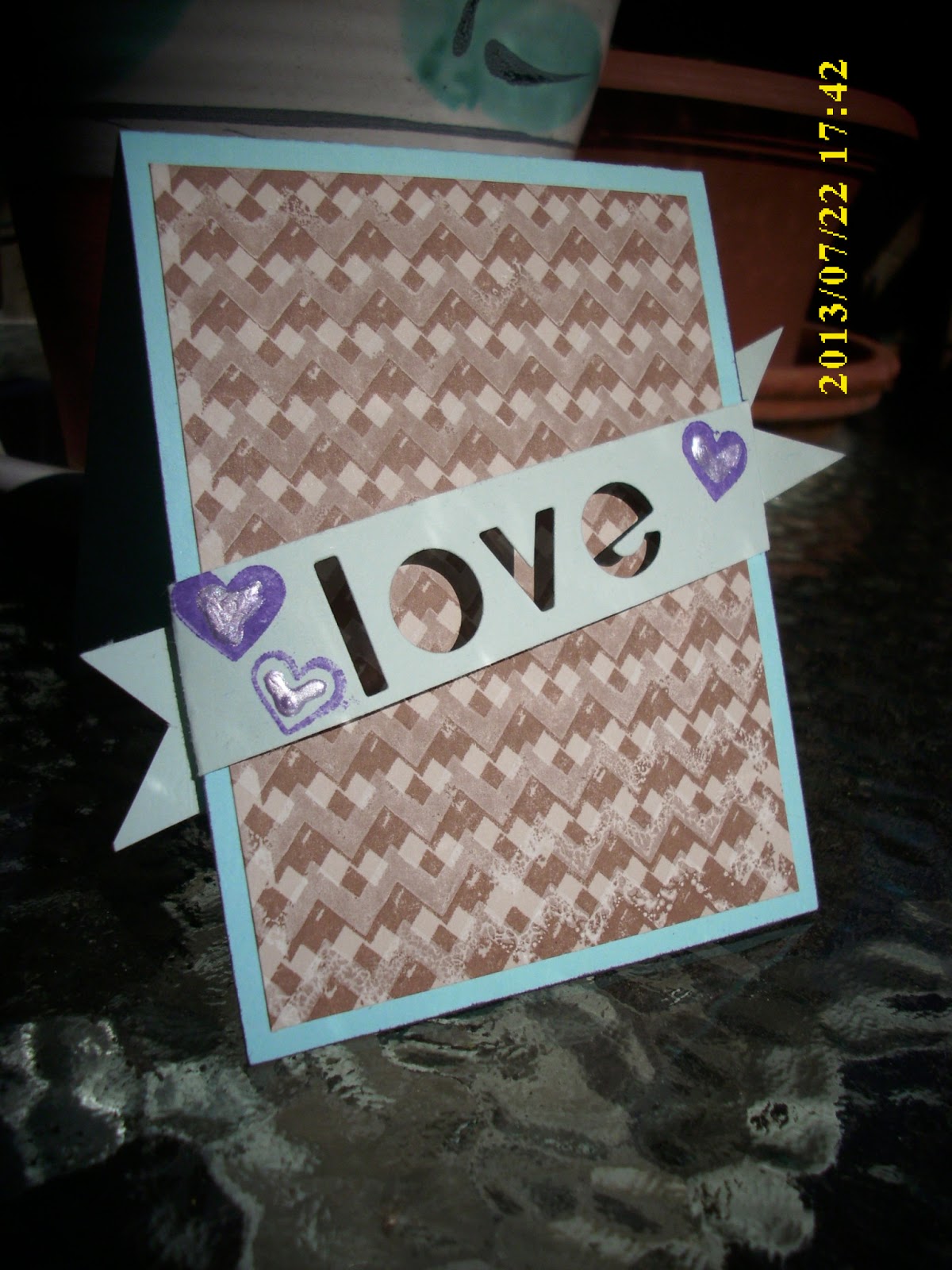
Even though this is a new week with a new lesson, I had to make another window card like we learned last week...just had to. I am determined this has to be easier than I've made it.

 Was it easier? Well, no, not really...as you can see, I STILL forgot to EMBOSS the window! DUH. When will I remember, besides the middle of the night in my sleep? I don't know, but the day will come, I'm sure. With this card, at the advice of  good friend with good taste, I painted the front just as I did on an earlier camp day. Painted the stamp, spritzed it, then ran it down the page. This was the result. The butterflies are in the same colors.


Okay, so here we are for today's lesson. We learned how to make circle cards, and for the middle layer, I followed teacher Kristina Werner's advice and inked up my craft mat with Distress Inks in blue, green and brown, then spritzed it with water before laying the watercolor paper down flat into the ink. The watercolor paper had been embossed with a floral image, which shows through after it hits the wet ink. Once it was dried, I cut it into the smaller circle for the card and, on the second card below, I layered with a silver embossed sentiment on vellum.

This was my first attempt. I created a very small inner circle so the printed sentiment would show through.

I decided I could do better, so here's my next try:

So, which one do you like the best? I'm curious. Please leave a comment and let me know. I love your comments, and they really make my day when I read them at the end of the day. Thank you!


Sunday, July 14, 2013

Day 5.Part 3

Here is a card I created following Jennifer McGuire's example with the pencil grid and stamped flower images, layered with vellum, stamped with VersaMark and embossed in silver. I tried to follow her example fairly close except for the floral embellishment beside the sentiment. She was right -- the pencil marks are absorbed into the paper with the stamped ink and it will not come off, no matter how much I erased! I was surprised, I admit.

Thanks for stopping by. Hope you like my card. Your comments really make my day, so go at it! BTW, I tried and tried and TRIED to get that date off the camera, but it just won't budge. It won't even give me the correct date, let alone get off there entirely. UGH.

Saturday, July 13, 2013

Day 5 Part 2

I had to give that acetate window another try in hopes a second run would make it easier and the card would be more pleasing to the eye. The result? Well, you tell me!


Yes, it was a little easier this time -- at least it took me less than six (6!) hours! This color combination is a little hard for me -- a bit out of my comfort zone, if you know what I mean. That's probably because I don't have the right shades that would work better together. Anyway, the paper I did use came from two (quite different) sources, which was necessary to get the pinks right. The cover sheet and one inside page was from the Lost & Found Madison Avenue 6 x 6 Designer Paper Pad by My Minds Eye. The other pieces were from  Provo's small Luxury Stack. Weird combination, I know, but the shades worked well together. I added borders of blue that came from my stash. The writing was in a gray tone. Think that covers it! No, actually, it doesn't. I forgot to emboss!!! Sheez...

Thanks for stopping by. I am thrilled by your comments. They truly help guide me toward my next card and motivate me for another project! I look forward to seeing you next class day.  Even if you're not from class, I'll be here, on the next class day!

Friday, July 12, 2013

Day 5, Acetate Window

 This card took me most of the day to create. It just went on and on and on and on, but I finally got it finished. First it was difficult to choose which colors I wanted to use, based on what paper I have available. With that, I knew it could be a long afternoon! Next, I couldn't get the die to cut the circle out of the card base because I'd already layered paper on top and it was too thick. After about 8 or 10 run-throughs, it cut and I was able to layer the acetate and make the window from first into the second page of the three-page card. Once that was done, I was able to finish up with flowers, swirls and the Happy Birthday sentiment.

Here, you can see the front and second pages in this card. I layered the opening page with pink and lace. Like Kristina Werner's example, I kept the last page in white and left it blank for personal notes.
Not a very flattering picture, but that shows you the three layers. This card turned out to be a bit bulky and would probably cost extra to mail. Otherwise, hand delivery would work fine.  Anybody have a birthday coming up? Hmmmmmm, let me see....could be!

Please make my day and leave a comment. I enjoy sharing with each other as class progresses. There's a lot to learn and we can always encourage each other with a simple comment. Hope you are enjoying Summer Card Camp as much as I am!

Layered Die Cut


We have been learning how to layer die cuts on our cards. You cut out the image wherever you want it on the card, then you layer several additional pieces on top. Using a different color helps create an incredible look. Cardstock in this light shade of blue has been one of the first colors I've reached for this week while preparing assignments for class. Fortunately, it was included in the group of colors we were to use!

For this card I started by gluing a piece of the blue cardstock behind the front piece of the card base so it would show through where the flower had been die cut. Then, I just started layering more pieces of the flower, one on top of the other, until I achieved the look I wanted. This shade of blue with the white looks so elegant to me, and I absolutely love my new border die! Putting it all together gave me a sense of peace and joy. The bracket dies were a gift, and I couldn't be more thankful!

Hope you like this card as much as I do. Please leave a comment. I read them every night and enjoy getting to know each of you as class progresses. And anyone else who might be taking a look, can you tell I'm learning anything? Be honest -- that's the only way I can grow in this craft. Thank you for stopping by!

Thursday, July 11, 2013

Day 4 Part 2, Again


Today was the day for our 10-Minute Challenge. My first card, (see below, with the folded circles), created soon after 9 AM class, was a success, as far as the timing is concerned. I wasn't too excited about the card, however, so by 4:30 in the afternoon I decided to try another card.

This time I went for Marion Vagg's example where she gave a tutorial for "Colored Die Cuts." I figured that couldn't be too hard, so I added some extra steps. For one, I die cut the edge of the cardstock that is embossed with Stampin Up's Manhattan Flower Embossing Folder. I love that EF--it looks so elegant. The Die-namic Bracket Edge Die just arrived in today's mail, which was exciting, so I had to use it! To help direct the eye, I added a strip of yellow paper just above the curved edge..

The butterfly is colored with Copic YR04, YR07 and RV29. I did not have the same colors Marion used in her example, but they are close. I also used a Sakura Gelly Roll Clear Star Glitter Pen and some small pearls. The sentiment is from Flower Friend stamp set from SSS. I think that's it...oh, yea! Did I make the 10-minute deadline? Did you notice how crooked the sentiment is? That's when the buzzer went off!

And here's how crooked everything else was by the time I got done!!!


Hope you like this afternoon's card. I am so glad you're here! Please leave a comment. Online Card Class Summer Card Camp 2 is awesome!


Day 4 Big Challenge!

Today we were assigned a Big Challenge -- to create a card, start-to-finish, in 10 minutes. TEN MINUTES! I refused to panic. If I did, great. If I didn't, I'd just try and try and try again!

Here's my very first attempt:


I learned this from a tutorial in class today. Start with one round circle on white cardstock. Then layer 8 circles, folded twice, around the top, spreading just a little so you can see both layers. Add bling  to connect the circle in the center. Stamp the sentiment, add more bling, and DONE! This took no time at all.

Did I make the challenge? What do you think? Of course! After all, I wouldn't quit until I did! Now, I think I'll go try it again...

Day 3, Part 2

Online Card Class's Summer Card Camp 2, still Day 3

After thinking over my first creation of the day (see earlier post), I realized it was too simple. I needed to add more. I reviewed the class videos again and then created this card that includes "stitching" (by pen) and banners rather than strips running down the column. Instead of die cutting letters,  I used Thicker Stickers. Those are fun--a lot thicker than regular alphabet stickers and usually a lot brighter, too. I also rediscovered a butterfly punch I'd forgotten I even had! Amazing what you learn in these classes! I thought the little pearls were perfect for the pink butterfly. Hope you do, too!

So, here's the second card for Day 3. Thanks for stopping by! I love your comments -- they truly make my day!


Wednesday, July 10, 2013

Pink


Pink, light pink and yellow were the colors for this Outlawz challenge, with the twist of adding leaves, which I made green. Sorry, but I just couldn't ink a pink leaf! Yellow, perhaps, but not pink!

So, here's a card full of hugs for you. Thanks for your visits, and please don't forget to leave a comment for me to read. That's what really makes my day!